
Video subtitle editor
VideoMyJob
UI/UX Design
CASE STUDY


Project overview
When posting on social media feeds where videos autoplay on mute, videos without subtitles receive less engagement. They are also not accessible to viewers who are hearing impaired. We saw an opportunity to include subtitles in the video creation process to provide additional value to our users and meet enterprise accessibility requirements.
Process
- Create user personas
- Understand tech requirements
- Conduct competitor research
- Sitemapping
- Wireframing
- High fidelity designs
- User Testing
- Analysing results
Understanding the user
User type 1: the VMJ champion
Within VideoMyJob teams, we see most success when there are users that champion video as a recruitment tool, encouraging the rest of the team to adopt. This is usually a recruitment manager. They care a lot about the engagement that they're getting on their videos and how it affects metrics that are important to them. We believed that this type of user would use subtitles to increase engagement on their videos. These users are time poor but will adopt new features when they see the value in it.
User type 2: just checking the box
The other type of user we foresaw using the subtitle editor were recruiters who were instructed to add them by managers. This would either be because their managers saw the value of subtitles or to meet an accessibility requirement set by the company. While not as time poor, this type of user would try to get through the process as quickly as possible.
Across both user types, using a large assortment of tools is not common and they are generally not tech savvy.
Across both user types, using a large assortment of tools is not common and they are generally not tech savvy.
User end goal
Add accurate subtitles to my video on all applicable platforms.
Understanding tech requirements
Audio transcription
Our developers were able to create a proof of concept using Amazon transcribe with around 90% accuracy depending on accent and pronunciation of words. This was an important step to undertake before design as not having audio transcribe would increase the user effort to add subtitles significantly and influence whether we thought the tool would provide enough value to our users for them to adopt.
Subtitle publishing
Another important technology unknown was whether users would be able publish their video with subtitles included and have them display on platforms correctly. Developers were able to upload videos from our platform to Facebook and YouTube with subtitles included. However, we could not publish to LinkedIn due to API limitations, so we knew we had to provide a solution for users that wanted to download their video and post them elsewhere with subtitles included.
Competitor research
Before diving into designing anything, I first researched subtitle editors to see what kind of features and UX solutions they had implemented while keeping in mind the specific type of user they are designing for. I used this to get inspired but also to see where poor UX tends to occur with this type of tool.
YouTube
- Automatic audio transcription takes out a lot of the work
- Has the flexibility to to add, edit and delete subtitles
- Ability to adjust the start and end time of each subtitle to perfect timing
- The user is able to reach a wide audience with the ability to add multiple subtitles in different languages
- They have the ability to save their subtitles as a draft and publish later
YouTube Subtitle Editor UI
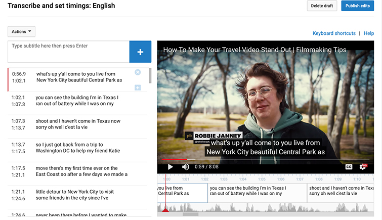
I found that the YouTube subtitle editor had good customisation options for users that want high quality subtitles and the ability to reach viewers from multiple countries. However, the extra features added to the complexity of the tool which resulted in a cluttered UI and lowered ease of use.
Clideo
- Does not automatically transcribe audio resulting in extra user effort
- Small, hard to read font
- Has the ability to customise the appearance of subtitles
- Users can download video with the subtitles added or download the subtitle file separately
Clideo Subtitle Editor
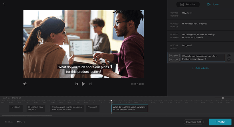
I found that Clideo had many useful features while not feeling overly cluttered. However, it was missing auto transcription which made adding subtitles time consuming. The ability to customise the appearance of subtitles if wanting to add subtitles directly on the video was a nice option.
Kapwig
- Unusual layout with low importance given to the video preview. Subtitles are stacked instead of horizontal, removing the need for horizontal scrolling
- Hard to view subtitle text on small video preview
- Subtitle styling options included
- Subtitle translation option is great
Kapwig Subtitle Editor
Kapwig had an uncommon layout with a small video preview and vertically positioned subtitle timelines. I found that wle the overall hierarchy placed the main task of subtitle editing at the top, a small video preview made it difficult to envision the subtitles.
Web sitemap
Once I had completed my competitor research, I started to create a sitemap for the VideoMyJob web experience. This allowed me to quickly figure out the basic user journey and how I might organise all the steps users need to take.

Subtitle editor exploration
After fleshing out the basic structure with a user flow diagram, I created some low fidelity sketches to explore different layouts. When I felt I was ready to flesh out the layouts further, I dove into high fidelity designs in Sketch. I created versions with features that, at this stage, we were not sure whether we wanted to include in version 1. This helped us to get a sense of what the editor could be like and if we felt these features would be valuable to our users.
Version 1
This version had the subtitle editing on a side pane to the left and a timeline below a video preview. It only had the option to save and cancel and was missing a couple of crucial options. However, I felt the hierarchy of different elements worked well though.
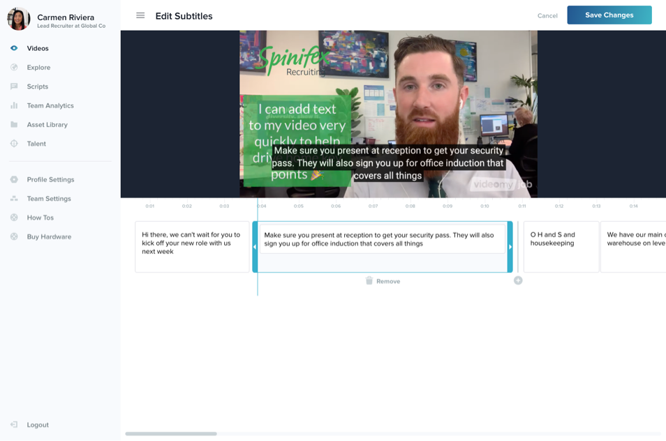
Combining subtitle text editing and timeline
This version allowed users to edit the subtitle text directly on the timeline which significantly decluttered the screen. There were downsides to this design though as users would have to use horizontal scrolling instead of vertical and, for users that only want to correct spelling and grammar, this was a more complicated experience.
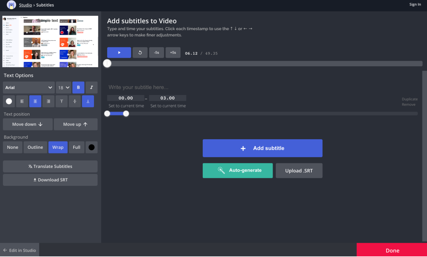
Exploring styling options for v2
In the navbar I added the option to toggle subtitles on and off. Having the ability to toggle the subtitles was crucial so that users could display them once they have checked for spelling and grammar mistakes.
I also explored how subtitle styling may work, adding the 'text' and 'design' tabs. While this wasn't planned for v1, it was good to make sure this feature would work with the rest of the subtitle editor I had designed.
I also explored how subtitle styling may work, adding the 'text' and 'design' tabs. While this wasn't planned for v1, it was good to make sure this feature would work with the rest of the subtitle editor I had designed.

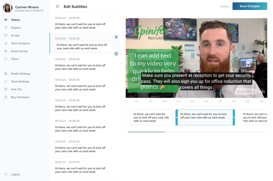
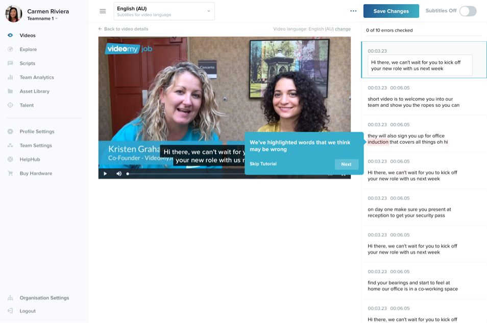
Final subtitle editor
In the final version of the subtitle editor, I shifted the text editing panel to the left so that the video was centered on the screen. I also simplified the options in the navbar and added a switch that clearly communicated whether the subtitles were on or not and that you could toggle this option.
The service we used for transcribing the video audio to subtitles also had a confidence rating which could indicate how confident it was that it had transcribed a certain word correctly. I was able to use this and highlight which words it may have gotten wrong. This made it easier for users to find potential errors. The progress bar also encouraged them to check them all before turning their subtitles on.
We were unsure whether or not to put in the development effort to include the timeline editor for adjusting timing. During user testing of early builds, the users didn't indicate that they wanted to adjust any of the timing, generally wanting to spend as little time as possible finessing the subtitles. This was great as we were able to validate the need for this feature before committing time to it. It also resulted in a simpler interface, increasing ease of use.
We also didn't include the option to add or delete subtitles, only to change the text. The result was a tool where the user was encouraged to only complete a handful of tasks; review, check spelling and grammar, and turn on the subtitles. Everything else was done automatically. When the user selected to turn on their subtitles, we also communicated what steps to take if they wanted to add subtitles on a platform that wasn't currently supported, such as LinkedIn, and linked to a step-by-step guide.
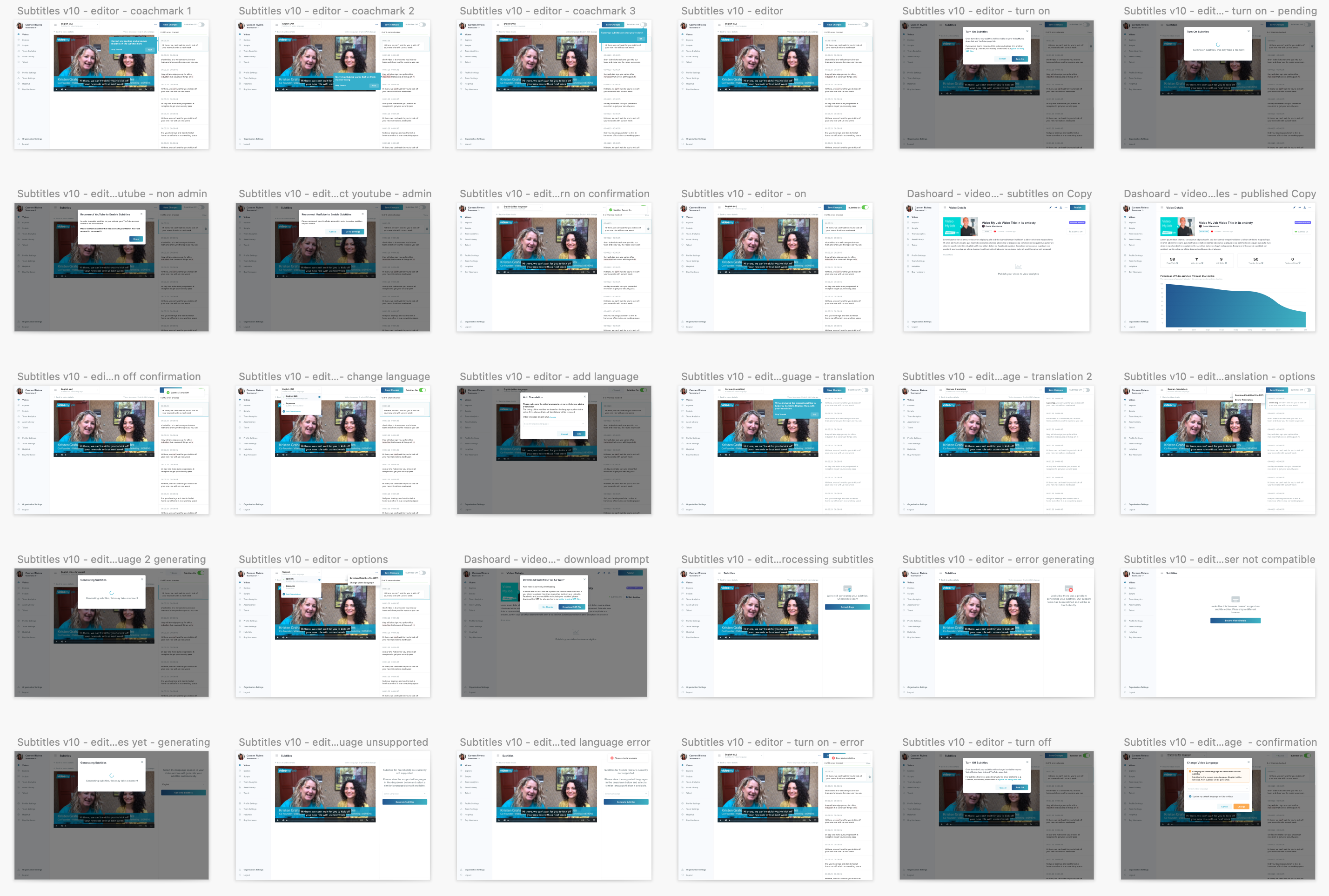
Final designs
The final designed include all modals, error states, empty states, etc.
Some other small details that improved the overall user experience included:
- tweaking subtitle character limit tolerance to avoid large blocks of text
- if a video has a caption overlay, the subtitles shift up so that they don't overlap
- coach marks added to help users understand how to use the subtitle editor
- users can re-transcribe subtitles if set to wrong language.
Results
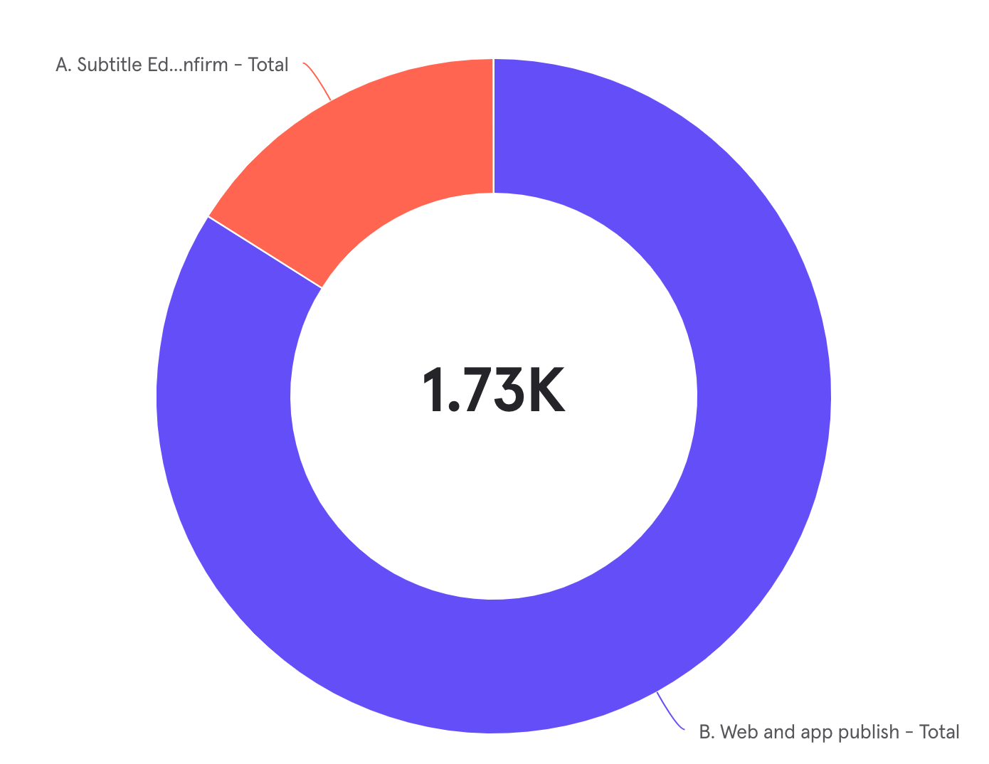
Subtitles turned on compared to video published
Since release, 16% of published videos had subtitles enabled. While not high, I feel that this is inline with the kind of adoption that we were expecting.
Subtitle editor completion time
On average, users who went from opening the subtitle editor to turning on subtitles and finishing editing within one sitting did so in 5 minutes and 54 seconds. We found that a completion time of five minutes on average was a great time and was inline with our goal to create an easy to use subtitle editor.

Conclusion
This project had many unknowns and a lot of reliance on tech to ensure a great user experience. We ended up with a subtitle editor that automatically created subtitles based on the audio of the video, with relatively high accuracy that takes little time.
There were opportunities during the project where I believe we could have overbuilt the editor and added features that were not necessary to meet our user goals. We could have added the ability to add and remove subtitles that were not placed there by the automatic transcription and added the ability to adjust timing slightly. I believe having these features here would have complicated the editor. I also believe giving more options would have made the tool harder to use and appear more intimidating to try out. Users may have felt inclined to use these and fiddle around with small details without much gain.
This project reiterated the value of MVP product development. We were able to test assumptions without using extra dev time and created an easy to use subtitle editor that met our users' goals.
